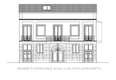

An email from our young and talented Italian architect was forwarded to me. He had sent along two new drawings he had made from the house. One shows the view of the front facade with the main entrance and one shows the view of the house by the see.
First I thought, there is something wrong about the second drawing. But then I realized, I had never seen the back of the house in that way. - Remember? We are located on a rock. You only would see the house in that perspective if you would 'fly' by. Usually you are about 50 meters below and in that perspective the house looks different,... shorter, shrinked, somehow.
What about using the main facade as a 'logo'. I was thinking of designing a 'logo' for dishes we would use in the palazzo. Maybe also to be embroidered on bathrobes, maybe napkins, maybe pillow cases etc.
Should the 'logo' resemble more the new drawing (above) with all the nice details or resemble more the 'reduced' drawing below?

Let me know what you think and I will post a draft soon.

Oh how fun! What a wonderful idea of incorporating your drawing into the design of other objects (dinnerware is a great idea!). I vote for using the first drawing.
ReplyDeleteI will be in Italy next week....I will be one of those tourists wishing that I, too, can someday build a beautiful palazzo there!
Hello MMI,
ReplyDeletethank you for your vote.
I envy you a bit for your trip to Italy. Have a safe trip, have fun and bring back some impressions to share!
Let's see. I vote for the top picture. I love all of the windows!
ReplyDeleteThe top drawing is lovely!What a lovely place you will have ...
ReplyDeleteI have been working on something ... that might not be usable as a logo... I think, I have to ask the architect first for the design of the door of the main entrance. He said he wants to design it. Let's see. Until soon.
ReplyDelete