Showing posts with label BLUE. Show all posts

July 16, 2011

Colourful Folly


From Angelo's pictures that he had sent via email I knew more or less how colourful the house would be. But he did not send me pictures of every corner .... he left surprises for us.

When I entered the house again after three months absence, I felt like Alice in Wonderland... And while opening and unpacking the last boxes and walking ten, twenty times in and out of the living room, I started to feel dizzy. Was this the summer heat - or was this the impact of all those colours?

I imagine painting so many walls and ceilings day after day, all alone, must have become more and more boring for Angelo. And I can imagine how he tried out one colour and another colour. He must have become more and more frantic when shopping for colours - it must have been a kind of colour flush that had overcome him!

"Colourful Folly", I thought, must be the title of a post to honour this work, conveyed from the German expression "der helle Wahnsinn", that leo.org translated into "plain folly".

I count seven (!) different colours

(the blue of the ceiling is different from the blue in the arch (which also is spatolato technique) and I counted the white (border, doors, radiator) as one colour.)


I have some chairs to upholster with some not yet choosen fabric... I guess it need to be very neutral fabric ;-) ... Usually I prefer white walls and play with colours of fabrics, paintings, ceramics, flowers etc. But okay, Angelo was our painting master in charge and this is the South of Italy. Lets first move in and see how it feels. Before getting crazy, I might have to find a brush, as Angelo always says...

the sunlight makes the colour of the window alcove shine brighter 

May 24, 2011

A Bathroom Vision in Blue

A dream of a bathroom! How colours can change the atmosphere! Actually it is not just painted blue walls, it is spatulato, a Venetian technique for making painted walls shine like marble.

a vision in blue

blue and pearl grey wall colour harmonizes two different pattern of Vietri tiles on wall and floor

the lighter blue of the ceiling matches one hue of the wall tiles

the wall paint reduces the strong contrast (see before here and here)

stucco borders frame the painted areas

view from above (while painting the ceiling)

beautiful perspective of a blue bathroom dream

A "specialist worker" waxing the surface of spatolato finish in order to obtain a surface similar to polished marble.

Bath room with spectacular sea view

I wish I could be there! I have not seen it in reality yet. I only have these photos for now and have to wait for summer. 

What a dream in blue!

Grazie Angelo!! You are becoming the new Michelangelo with this project! Thank you for choosing the right blue and for spending so much time on the spatulato technique.

May 14, 2011

Stunning entrance room with Chandelier

Bohemian crystal chandelier and another blue ceiling

Angelo surprised us with an impression of the entrance room.
LC, my son, and I were speechless starring at the screen of the computer when the picture opened up. Not only the chandelier, that is a gift from my mother-in-law, who found the chandelier one day on the street (!) slightly dammaged and with missing parts and had it restored, but also the choice of blue that Angelo painted on the ceiling - both together looks so stunning! Angelo said he mixed colours we did not use in the living room (see colour testing in the living area) and tried out different shades until he was happy with the result. I am very happy too!

Stuning surprise again, GRAZIE !
Looking forward to the master bathroom surprise coming tonight via email...

May 10, 2011

Colour Testing for the Masterbath and first Results

You might remember my wild mesmerising Vietri tile combination in our master bathroom (and here). There were doubts if it should remain like that with white walls. Or whether we paint the walls in a deeper blue at the same hight as tiles end behind the sink and toilet. - Let's try it out we said:

greenish paint from the 1st colour testing in the  living room

Although, we had a deeper blue in mind, I saw during the colour testing in the living room, that the greenish paint would perfectly match the wall tiles in the masterbathroom. If we would not use it in the living room, we could use it up here.

view from further away

But the floor tiles are totally different and the contrast to the wall would be even bigger than it is already now. That's why we had already bought a blue colour sample to try out in the bath. It is the same metallic antique type paint we are using in the living room.

metallic "antique" blue paint

Nice try. But the metallic effect is too strong in this bright room and the blue does not really match the floor either. Angelo had to cover the trial again with white paint and find a new solution. We did not dare to ask him to do a "spatulato" wall. This is a traditional Venetian finish. Originally made with chalk powder, oil, natural glue from animals and natural pigments. Nowadays, acrylic or vinyl resin is used, but it still requires a lot of work. But Angelo proposed it himself!

spatulato finish 

This is the only photo Angelo has send from the wall. I guess, at that time the other walls were not finish or the room was still too messy to shoot a photo from the entire room. 

bathroom ceiling

But we have ceiling photos. It is a light blue, but not as light as used before in the piano terra for the ceilings of the entrance #37, the kitchen and the window's niches. I asked him to match the blue a bit with the blue of the wall tiles. I think he used the same hue as used on the ceuiling in the corridor in front of the green bathroom. And this is perfect!

bathroom walls and ceiling

A white stucco border was added on top of the mid-hight tiled wall and runs now around all walls. The colour of the ceiling is taken down on the wall to form an app. 20 cm wide border. This reduces the felt hight and is supposed to make the room cosier. This blue border is also limited by a stucco border, that is however a bit wider than the first stucco border. Inbetween the walls Angelo used the same "pearl" white or grey paint as in the living room. The grey colour is supposed to look warmer than a plain white.

I am myself curious how the wall looks behind the bath tub and on the opposite site! Angelo, please send more photos!

March 30, 2011

Sneak Peek into the Blue Bathroom

Our sixth and last bathroom seems to become a new highlight of our renovation project :

a shower inside a niche of blue mosaic

sanitary equipment not installed yet, vaulted natural stone ceiling restored

blue tiles on opposite wall, natural stone wall restored

March 27, 2011

Horizontal Wall Stripes

Angelo did it: 
Horizontal stripes in the small corridor:

horizontal stripes and door to the green bathroom

view towards side entrance area

view towards dining area and kitchen

view towards kitchen with balcony in the back

two horizontal stripes

Not only I am impressed with the speed Angelo implemented my proposal, I am also impressed by the result. The two painted blue horizontal stripes look as interesting as I thought they would.

I discovered something else in the pictures: the passage way towards the dining area and kitchen is wide and open. I was not sure if there would be a door, it looks better this way! And you see the original thick walls (egg last pic)! They are about 1 meter thick. (The art work Angelo did on these walls I need to check out on site next month.)

But this is not all.
I got also vertical stripes !!!
But this in another post.


March 24, 2011

Work Progress in Pizzo

Angelo decided to give his new light sky blue ceiling an apricot framing

The sixth and last bathroom will be a blue bathroom - it's the one in the guest residence

waterproofing of last bathroom floor (seminterrato)

March 22, 2011

Ceilings: Some lighter blue paint

Angelo tries out a lighter blue in another corridor
(all three panels are painted in the same hue)

the light sky blue in comparison to the other recent bright blue

for comparison of hues and for orientation - both are corridors 

The story behind:

March 16, 2011

Blue Ceiling by Angelo

Today I receive a blue ceiling via email :


And the text massage goes like this :

The ceiling of the corridor in front of the ground floor bathroom. I missed the blue after so long time! Is that ok? What color do you want the walls? White? Light yellow? Light ocra? Light pink?
Ciao
Angelo
Ah, I have missed Angelo's humour. I almost forgot about his "blue" addiction, didn't thought it's that strong! I wrote back that I like it. Light blue makes the ceiling appear higher - not that this was necessary in our case - but here the blue leads the eye towards the center. You do not notice right away that the ceiling is not symmetrical. And I really like that simple Art Nouveau lamp. We had it in storage so far - can you believe that? ... it never had a place to beam. Not sure though, if this short side corridor is the right place. We might have a better spot, but will see. Regarding the walls I opted for just white paint as this is a small and rather dark corridor. If this is too boring we can repaint it later.

I am happy with this Wednesday mail by Angelo. Grazie! 

June 19, 2010

ringhiera blu


I am jealous myself ...


I can't be there right now.
Instead I am sitting here in super cold Germany with 10 degrees and rain.
But at least I have something to dream about !!! :-)

PS: one would almost not see the antenna....

-------------------------------------------------------------------------------
And here to compare one "BEFORE blue paint" picture:


-----------------------------------------------------
photo update of the completet ballustrade:


Fantastic job, Angelo ! Salute, cincin !


June 16, 2010

blue blue blue


Isn't this colour amazing ?
This ringhiera (balustrade) is not for bellezza (beauty). It is for safety.
But now, with this blue coat of paint it became really beautiful !


And here we have the first bathroom to come to life !
With some blue colour it looks so inviting !

Many ask me what the palazzo is doing. It is progressing so fast ! You won't believe it because I have no time to blog. But Angelo is still on site and pushes the work continiously. He is there everyday. And he sends me pictures everyday. I just can't keep pace with him and post everything new and pretty.

BTW, I am back from Bangkok (back in Germany). I spent there three full days. We did decide on the school for our son. But not about the place to live in. Actually, I could start the countdown for the move to Thailand now ...

Unfortunately our German school holidays for this summer start late (end of July) and the British international school holiday in Thailand end early (mid August), so there is no time to spend summer holiday in Italy in our house and on the beach. It seems that we have to wait until next year to enjoy what Angelo is preparing and organizing so well.

August 16, 2009

Terrace : Amalfi Style


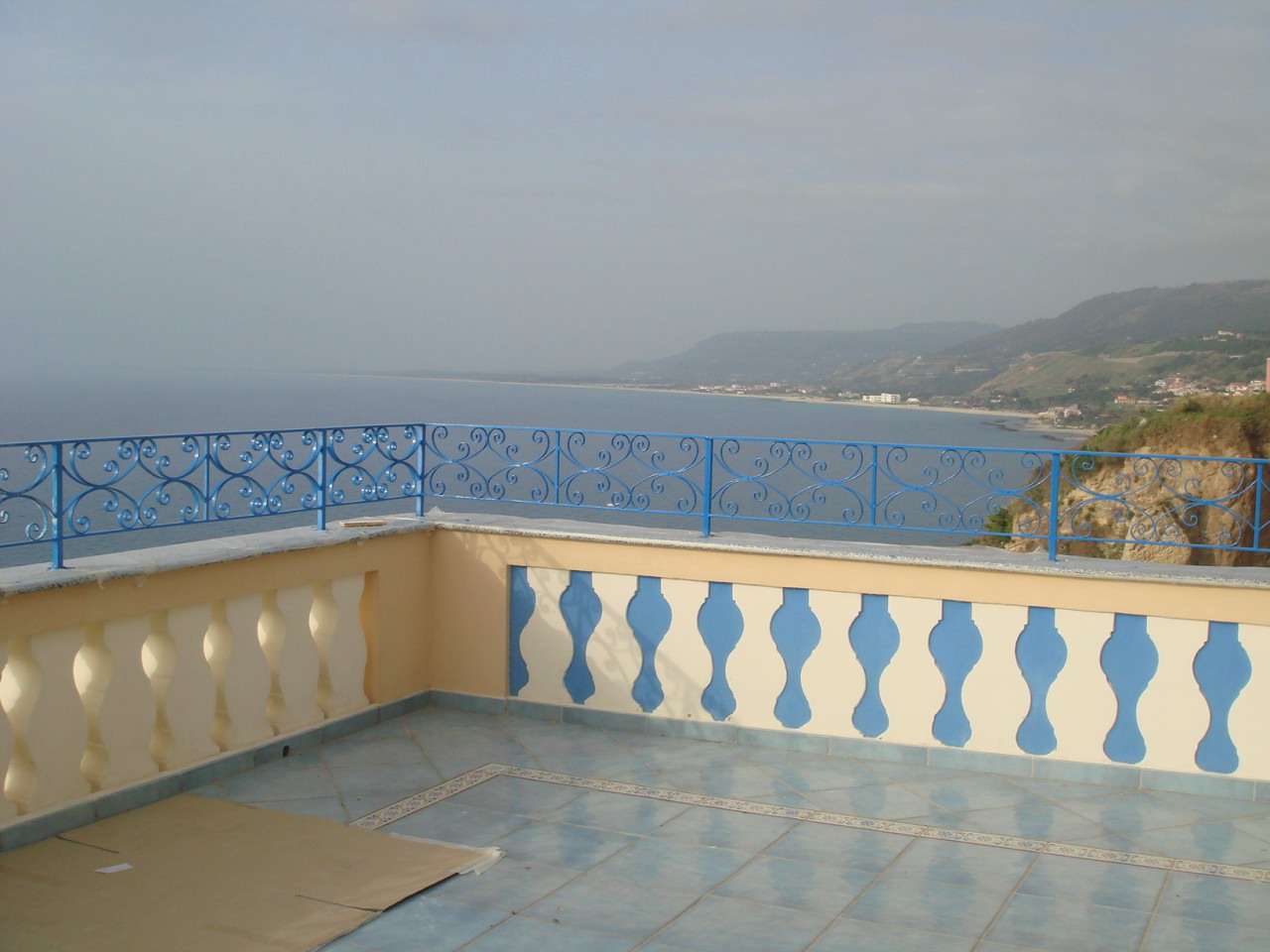
The water blue tiles (color Zaffiro, serie Emozioni) and the listelli, that make the decorative border are both from Fornaci d'Agostino in Salerno. This company is one of the well-known producers of famous Vietri ceramics (Ceramica di Vietri). The ceramic's name comes from the small village Vietri Sul Mare with its many ceramic crafters, located close to Salerno at the East of the Amalfi coast. The beautiful colorful ceramic tiles became famous together with the picturesque dream destinations Positano at the Amalfi coast and the island of Capri.

With all these mouthwatering names and links, I am sending you some warm and sunny greetings from Italy. Happy day !