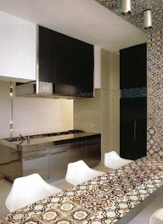
mixing and playing with tiles
Something unique that you would never find in another place, something that you would look forward to see in your seaside home. Colourful tiles from Vietri (near Salerno) or from Sicily - yes! But how could we decide on one design or one colour? They are all so beautiful!
This is when I remembered the beautiful effect of mixing antique ceramic tiles.
Here my favorties samples:
wild mix of antique tiles in the kitchen of Stefano Gabbana and Domenico Dolce (D&G) in Portofino
mix of antique Vietri tiles by Antica Ceramica in the kitchen of Villa Thun in Capri
more antique ceramic tiles outside Villa Thun, Capri via Elle Decor
modern mix of antique Vietri tiles in a 18th century villa in Positano realised by Lazzarini Pickering Architetti
kitchen and dining area of same Positano Villa
(geometric effects and patterns stand ahead of colour effect)
fresh mix of colour and pattern on restaurant wall at Verdura golf resort in Sicily
After this presentation I had my husband convinced that we should look for a good mix of tiles instead of one single design only. And this is what I did then on Sunday: google, print, cut and puzzle ...
cut and paste with paper tiles
I had "analysed" the different mixtures above and found that they all use 20 x 20 cm tiles and that although many different patterns were chosen, half or more of them where independent designs, only few tiles where just part of a pattern of four tiles. This is quiet interesting, since although sometimes more than eight different tiles were used for a wall the overall effect was still harmonious.
Our supplier, Callipo in Vibo Valentia, has a good selection of Vietri tiles, thereof Francesco de Maio is our favorite manufacturer.
Since I am not familiar with Angelo's computer, I did "cut and paste" in a very traditional way. I printed the pages from the downloaded de Maio catalogue and cut with sisors the tiles we liked. This even worked out better, as I can now easily move little puzzle pieces and check out the best effect. As we need 7 m2 for the kitchen, and the minimum order is 1 m2 per design, we might order these seven different designs we had chosen above.
And, if one is undecided between wallpaper and tiles, I just found this solution - it looks like a tiled wall but it's not:
wallpaper design by wall and deco via Spazio Casa
This is not a solution for wet areas in bathrooms or kitchens - and regarding the price (98 Euro/m2), you better go for real Vietri tiles, maybe not the antique ones, but antique pattern newly manufactured are available for less, depending on the design and colour.


I'm sure, it will look very nice. Just your handcrafted sample has a warm feeling to it, I think.
ReplyDeleteIt looks super super good! I was a bit nervous about the result, but I really can recommend it! But the mix must be planned.
ReplyDelete